用几个例子彻底掌握前端滚动相关动画
· 阅读需 4 分钟
1. 滚动时文字颜色动态改变
效果:
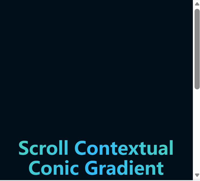
实现原理
- 使用
conic-gradient和background-attachment: fixed创建一个固定于视口的渐变背景。 - 通过
background-clip: text和-webkit-background-clip: text将背景裁剪为文字形状。 - 设置
-webkit-text-fill-color: transparent使文字透明,从而显示背景渐变。
关键在于 background-attachment 这个属性,它决定背景图像的位置是在视口内固定,或者随着包含它的区块滚动。值是fixed时,表示背景相对于视口固定。即使一个元素拥有滚动机制,背景也不会随着元素的内容滚动。
示例代码
<style>
  article {     /* 核心样式 */
    background-image: conic-gradient(
        hsl(100 100% 60%),
        hsl(200 100% 60%),
        hsl(100 100% 60%)
    );
    background-attachment: fixed;
    background-clip: text;
    -webkit-background-clip: text;
    -webkit-text-fill-color: transparent;
    text-align: center;
  }

  body {
    background: hsl(204 100% 5%);
    color: white;
    min-block-size: 200vh;
    padding: 5vmin;
    font-family: system-ui;
    font-size: min(200%, 5vmin);
  }

  h1 {
    font-size: 10vmin;
    line-height: 1.1;
    max-inline-size: 15ch;
    margin: auto;
  }
</style>

<body>
  <article>
    <h1>Scroll Contextual Conic Gradient Text</h1>
  </article>
</body>
2. 视差滚动文字效果
效果展示
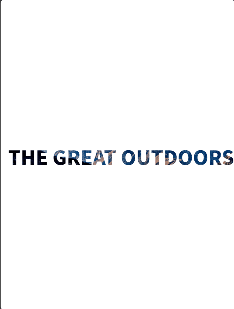
实现原理
这个效果的核心思想是**"同一个文字,用同一张背景图,分别做两种处理"**,利用两层文字的叠加创造视差效果:
第一步:准备两个完全相同的文字层
- 上层:镂空文字(文字透明,显��示背景图)
- 下层:普通文字(背景图固定在视口)
第二步:让它们完美重叠
- 两个文字的位置、大小、字体完全一致
- 使用
position: fixed将它们都固定在屏幕中央 - 这样它们会完美叠加在一起
第三步:关键区别
上层文字(镂空层):
- 用
background-image: url(图片)设置背景图 - 用
background-clip: text把背景裁剪成文字形状 - 用
-webkit-text-fill-color: transparent把文字本身变透明 - 结果:只看到文字轮廓里有背景图
下层文字(背景层):
- 同样的背景图
- 关键属性:
background-attachment: fixed—— 背景图固定在视口不动 - 文字是白色的(
color: #fff) - 结果:整个区域都有背景图
第四步:滚动时的魔法 当你滚动页面时:
- 上层的文字轮廓会随着滚动而移动
- 下层的背景图因为
fixed属性,固定在屏幕上不动 - 两者的相对位置产生变化
- 就产生了"透过镂空文字看背景"的视觉效果
示例代码
<style>
  header {
    height: 200vh;  /* 创造滚动空间 */
  }

  .container {
    position: absolute;
    height: 100vh;
    width: 100%;
    mask-image: linear-gradient(#fff);
  }

  .title_wrapper {
    position: fixed;  /* 固定在视口中央 */
    display: block;
    margin: auto;
    width: 100%;
    top: 50%;
    transform: translateY(-50%);
  }

  .title_wrapper h1 {
    text-align: center;
    font-size: 64px;
    text-transform: uppercase;
    font-weight: 900;
  }

  /* 上层:镂空文字 */
  .container_solid .title_wrapper h1 {
    background-image: url(./imgs/mountain.jpg);
    background-size: cover;
    background-position: center;

    /* 将背景裁剪为文字形状 */
    background-clip: text;
    -webkit-background-clip: text;
    -webkit-text-fill-color: transparent;

    /* 兜底文字颜色 */
    color: black;
  }

  /* 下层:固定背景 */
  .container_image {
    top: 100vh;  /* 放在下一屏位置 */
    background-image: url(./imgs/mountain.jpg);
    background-size: cover;
    background-position: center;
    background-attachment: fixed;  /* 关键:背景固定在视口 */
    color: #fff;
  }

  section {
    min-height: 100vh;
    padding: 2em;
    margin: auto;
    max-width: 800px;
  }
</style>

<body>
  <header>
    <div class="container container_solid">
      <div class="title_wrapper">
        <h1>The Great Outdoors</h1>
      </div>
    </div>

    <div class="container container_image">
      <div class="title_wrapper">
        <h1>The Great Outdoors</h1>
      </div>
    </div>
  </header>

  <section>
    <h2>滚动页面查看效果</h2>
    <p>这里是示例内容,用于创造滚动空间...</p>
  </section>
</body>